


2004~ 
SVG WG 2011~
CSS WG 2015~

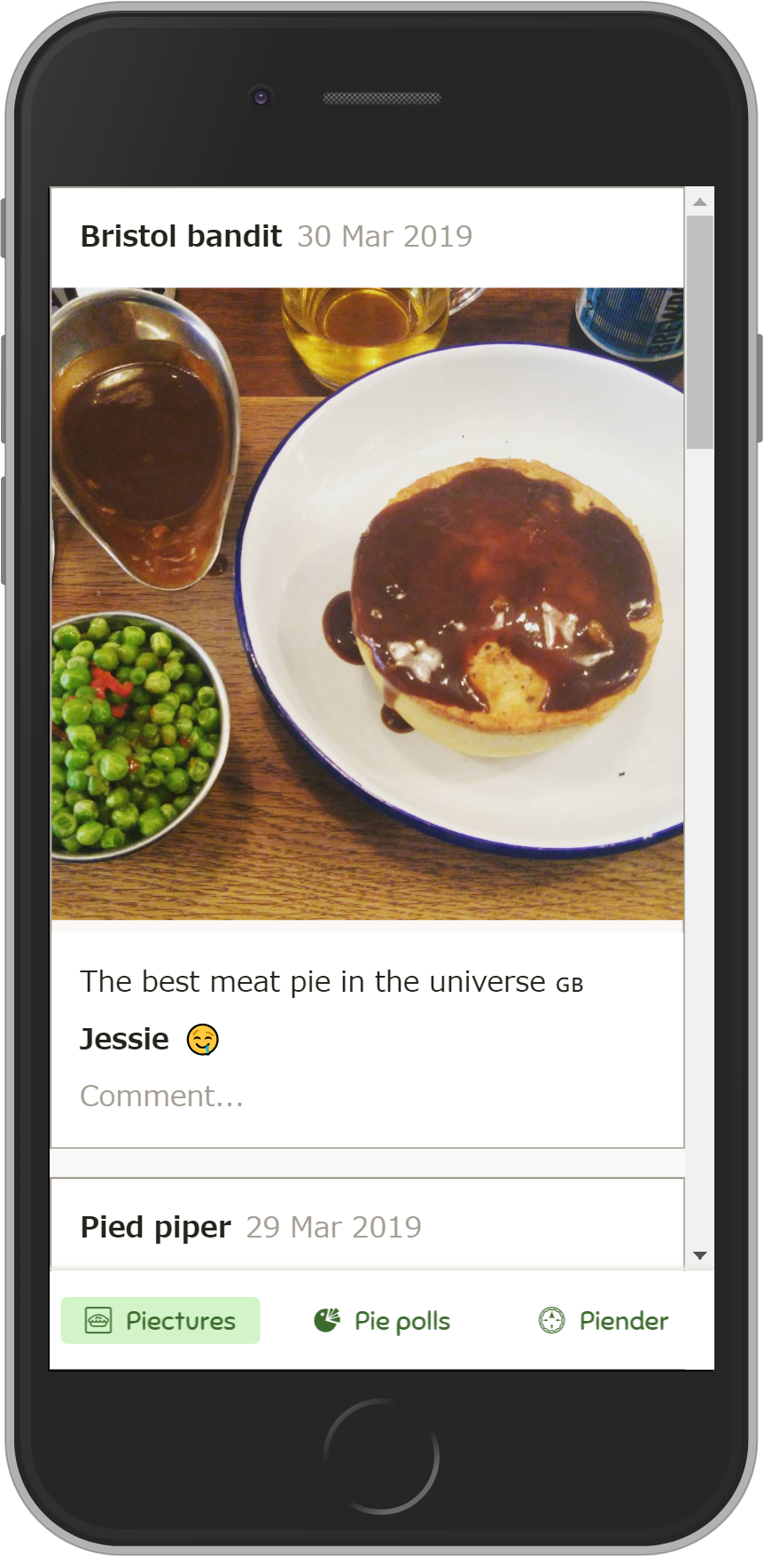
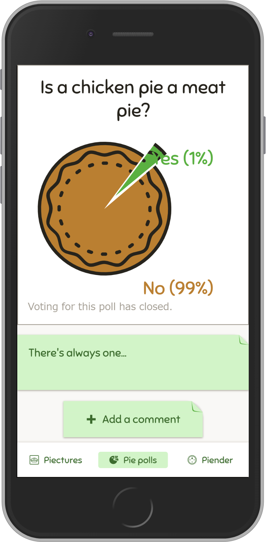
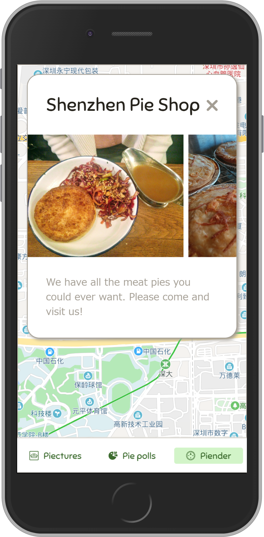
- The first social network for meat pie lovers!
- PWA (Pie Web App)
- CSS Transitions
- CSS Animations
- Web Animations API
- Performance (and DevTools)
- Accessibility
.pie {

}
.pie:hover {
  transform: scale(2);
}
button.onclick = () => {
  // Make the panel
  const panel = document.createElement('div');
  panel.classList.add('panel');
  panel.textContent = 'Hello!';
  parent.appendChild(panel);

  // Stretch it in
  panel.style.transform = 'scale(0)';
  panel.style.transition = 'transform .5s';
  panel.style.transform = 'scale(1)';
};
- opacity changed 0 → 1!
- transition specifies a transition time for opacity
- ⇒ Make a new transition!
  button.onclick = () => {
    const panel = document.createElement('div');
    ...
    panel.style.transform = 'scale(0)';
    panel.style.transition = 'transform .5s';
    panel.style.transform = 'scale(1)';
  };
- transform is scale(1).
- Previous transform is... empty.
button.onclick = () => {
  // Make the panel
  const panel = document.createElement('div');
  ...

  // Stretch it in
  panel.style.transform = 'scale(0)';
  panel.style.transition = 'transform .5s';
  requestAnimationFrame(() => {
    panel.style.transform = 'scale(1)';
  });
};
  button.onclick = () => {
    const panel = document.createElement('div');
    ...
    panel.style.transform = 'scale(0)';
    requestAnimationFrame(() => {
      panel.style.transform = 'scale(1)';
    });
  };
- transform is scale(1).
- Previous transform is... still empty.
button.onclick = () => {
  // Make the panel
  const panel = document.createElement('div');
  ...

  // Stretch it in
  panel.style.transform = 'scale(0)';
  panel.style.transition = 'transform .5s';
  requestAnimationFrame(() => {
    requestAnimationFrame(() => {
      panel.style.transform = 'scale(1)';
    });
  });
};
  button.onclick = () => {
    ...
    panel.style.transform = 'scale(0)';
    requestAnimationFrame(() => {
      requestAnimationFrame(() => {
        panel.style.transform = 'scale(1)';
      });
    });
  };
- transform is scale(1).
- Previous transform is scale(0).
- ⇒ Make transition!
button.onclick = () => {
  // Make the panel
  const panel = document.createElement('div');
  ...

  // Stretch it in
  panel.style.transform = 'scale(0)';
  getComputedStyle(panel).transform;
  panel.style.transition = 'transform .5s';
  panel.style.transform = 'scale(1)';
};
  button.onclick = () => {
    const panel = document.createElement('div');
    ...
    panel.style.transform = 'scale(0)';
    getComputedStyle(panel).transform;
    panel.style.transition = 'transform .5s';
    panel.style.transform = 'scale(1)';
  };
- transform is scale(1).
- Previous transform is scale(0).
- ⇒ Make transition
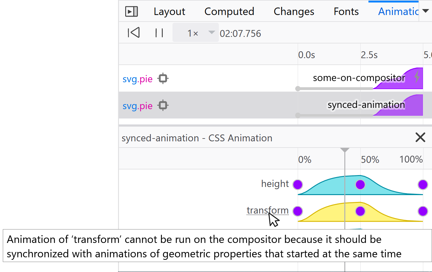
- Be careful with:
createElement- “rendering” using a framework (e.g. React etc.)
display: none
getComputedStyle(elem)does NOT update stylegetComputedStyle(elem).<property>does
- Using
getComputedStylecan be expensive - Consider CSS Animations or Web Animations instead
button.onclick = () => {
  // If the panel already exists, remove it.
  panel.remove();
};
button.onclick = () => {
  // If the panel already exists, remove it.
  panel.style.transform = 'scale(0)';
  panel.addEventListener('transitionend', () => {
    panel.remove();
  });
};
- The element becomes
display:none? - The element is re-created? Re-“rendered”?
- The
transition-propertyproperty changes? - The element is removed?
The transition will be canceled!
transitionend will never fire!
button.onclick = () => {
  // If the panel already exists, remove it.
  panel.style.transform = 'scale(0)';
  panel.addEventListener(
    'transitionend',
    () => { panel.remove(); }
  );
};
setTimeouttransitioncancelevent- 53+
 74+ (April)
 Tech Preview
 x
x
- Also
transitionrunevent- Make sure there is a transition in the first place!
button.onclick = () => {
  // If the panel already exists, remove it.
  const dropPanel = () => { panel.remove(); };

  panel.style.transform = 'scale(0)';
  panel.addEventListener(
    'transitionend',
    dropPanel
  );
  panel.addEventListener(
    'transitioncancel',
    dropPanel
  );
};
.pie {

}
@keyframes spin {
  0%   { transform: rotate(0deg); }
  100% { transform: rotate(360deg); }
}
button.onclick = () => {
  // Make the panel
  const panel = document.createElement('div');
  ...

  // Stretch it in
  panel.style.transform = 'scale(0)';
  getComputedStyle(panel).transform;
  panel.style.transition = 'transform .5s';
  panel.style.transform = 'scale(1)';
};
@keyframes stretch-in {
  from { transform: scale(0); }
  to { transform: scale(1); }
}
button.onclick = () => {
  // Make the panel
  const panel = document.createElement('div');
  ...

  // Stretch it in
  panel.style.animation = 'stretch-in .5s';
};
.pie {
  animation: fancy 2s infinite;
}
@keyframes fancy {
  0%   { transform: none; }
  50%  { transform: scale(1.5) rotate(0deg); }
  90%  { transform: scale(1.5) rotate(360deg); }
  100% { transform: scale(1.5) rotate(360deg); }
}
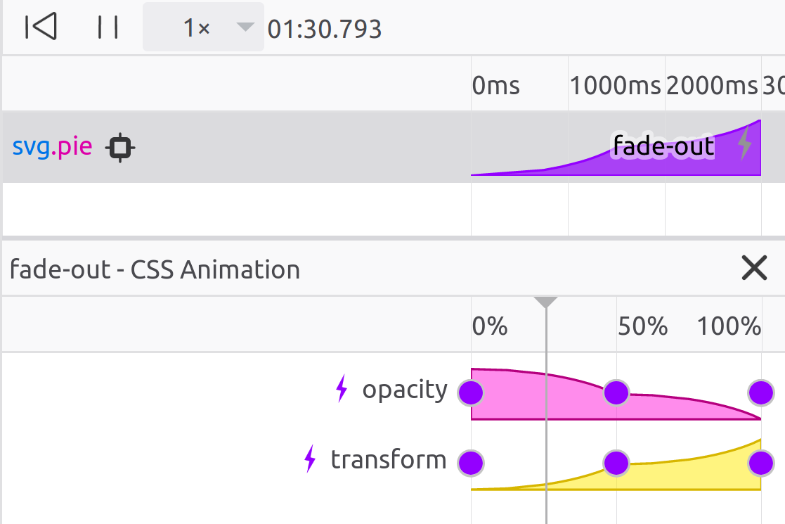
.pie {
  animation: fade-out 3s forwards infinite
             cubic-bezier(0.7, 0.0, 1.0, 1.0);
}
@keyframes fade-out {
  0%   { transform: scale(1.0); opacity: 1.0; }
  50%  { transform: scale(1.5); opacity: 0.5; }
  100% { transform: scale(2);   opacity: 0.0; }
}
.pie {
  animation: fade-out 3s forwards infinite;
  animation-timing-function: ease;
}
@keyframes fade-out {
  0%   { transform: scale(1.0); opacity: 1.0; }
  50%  { transform: scale(1.5); opacity: 0.5; }
  100% { transform: scale(2);   opacity: 0.0; }
}
.pie {
  animation: fade-out 3s forwards infinite;
}
@keyframes fade-out {
  0%   { transform: scale(1.0); opacity: 1.0;
         animation-timing-function: ease; }
  50%  { transform: scale(1.5); opacity: 0.5;
         animation-timing-function: ease; }
  100% { transform: scale(2);   opacity: 0.0;
         animation-timing-function: ease; }
}
.pie {
  animation: fade-out 3s forwards infinite
             cubic-bezier(0.7, 0.0, 1.0, 1.0);
}
@keyframes fade-out {
  0%   { transform: scale(1.0); opacity: 1.0; }
  50%  { transform: scale(1.5); opacity: 0.5; }
  100% { transform: scale(2);   opacity: 0.0; }
}
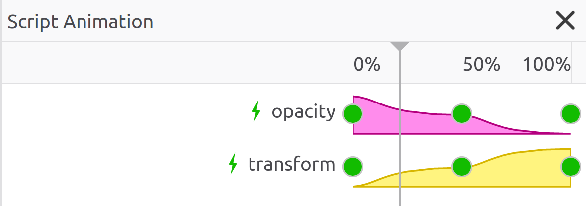
pie.animate(
  {
    transform: ['scale(1)', 'scale(2)'],
    opacity: [1, 0],
  },
  {
    duration: 3000,
    iterations: Infinity,
    easing: 'cubic-bezier(0.7, 0.0, 1.0, 1.0)',
  }
);
- vs other JS
- Performance
- No library
- Combines with CSS
- vs CSS
- Procedural
- (In future) CSS to create, JS to control
- 48+
- 36+
- Tech Preview
- x
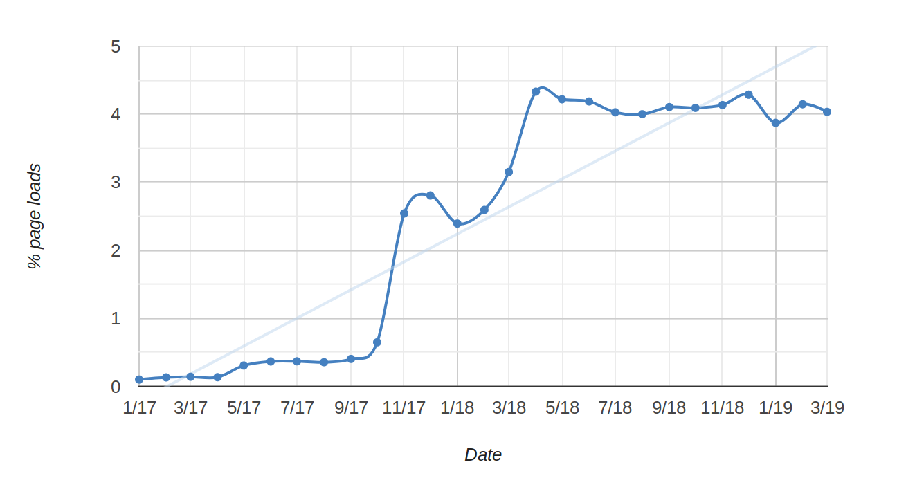
5th most popular API in 2018 State of JS survey
// Check for browser support.
//
// TODO: Check for _user_ support too (see point 9)
if ('animate' in elem) {
  // ... Animate away...
}
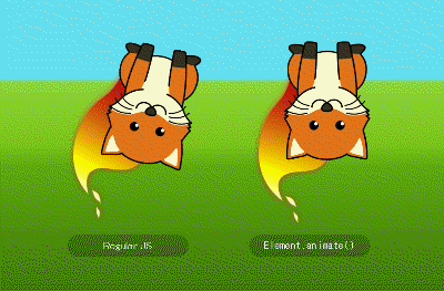
You might not need the polyfill (web-animations-js).
| CSS transitions/animations | Web Animations |
|---|---|
| animation-iteration-count | iterations |
| transition-timing-function, animation-timing-function | easing |
| Default easing is ease | Default easing is linear |
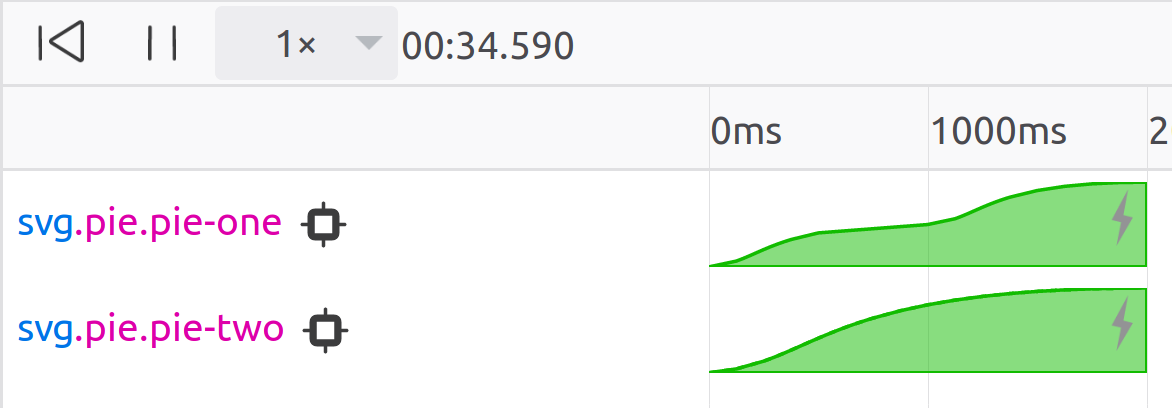
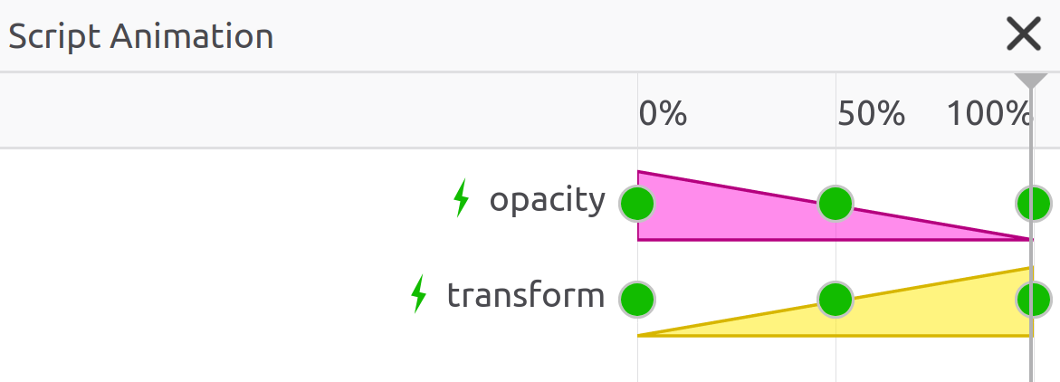
pieOne.animate(
  {
    transform: ['scale(1)', 'scale(1.5)', 'scale(2)'],
    opacity: [1, 0.5, 0],
    easing: 'ease',
  },
  {
    duration: 2000,
    iterations: Infinity,
  }
);

pieTwo.animate(
  {
    transform: ['scale(1)', 'scale(1.5)', 'scale(2)'],
    opacity: [1, 0.5, 0],
  },
  {
    duration: 2000,
    iterations: Infinity,
    easing: 'ease',
  }
);

react.render(
  <Router>
    <Route exact path="/" component={Photos} />
    <Route path="/polls" component={Polls} />
    <Route path="/finder" component={Finder} />
  </Router>
);
<Router>
  <Route render={({ location }) => (
    <TransitionGroup>
      <CSSTransition key={location.pathname}
        timeout={400} classNames="slide">
        <Switch location={location}>
          <Route exact path="/" component={Photos} />
          <Route path="/polls" component={Polls} />
          <Route path="/finder" component={Finder} />
        </Switch>
      </CSSTransition>
    </TransitionGroup>
  )}/>
</Router>
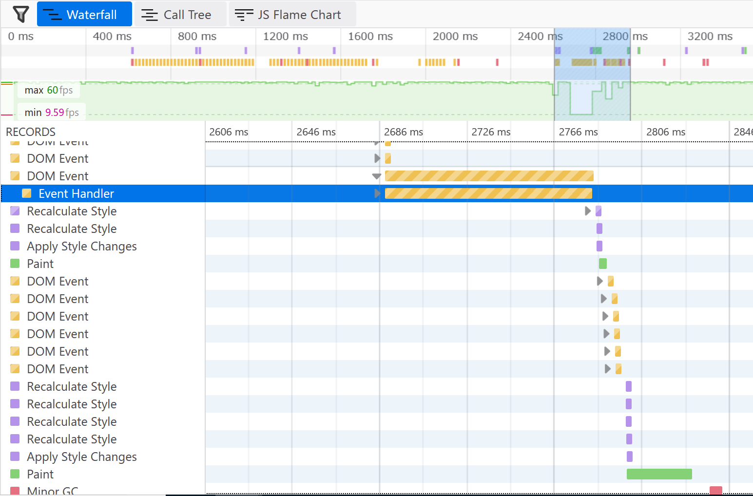
- Handle click
- Create DOM elements
- Resolve style
- (
<CSSTransition>resolves style and layout multiple times)
- (
- Calculate layout
- Paint each new element
- Run the transition
<Router>
  <Route render={({ location }) => (
    <Photos active={location.pathname === '/'}/>
    <Polls active={location.pathname === '/stories'}/>
    <Finder active={location.pathname === '/notes'}/>
  )}/>
</Router>
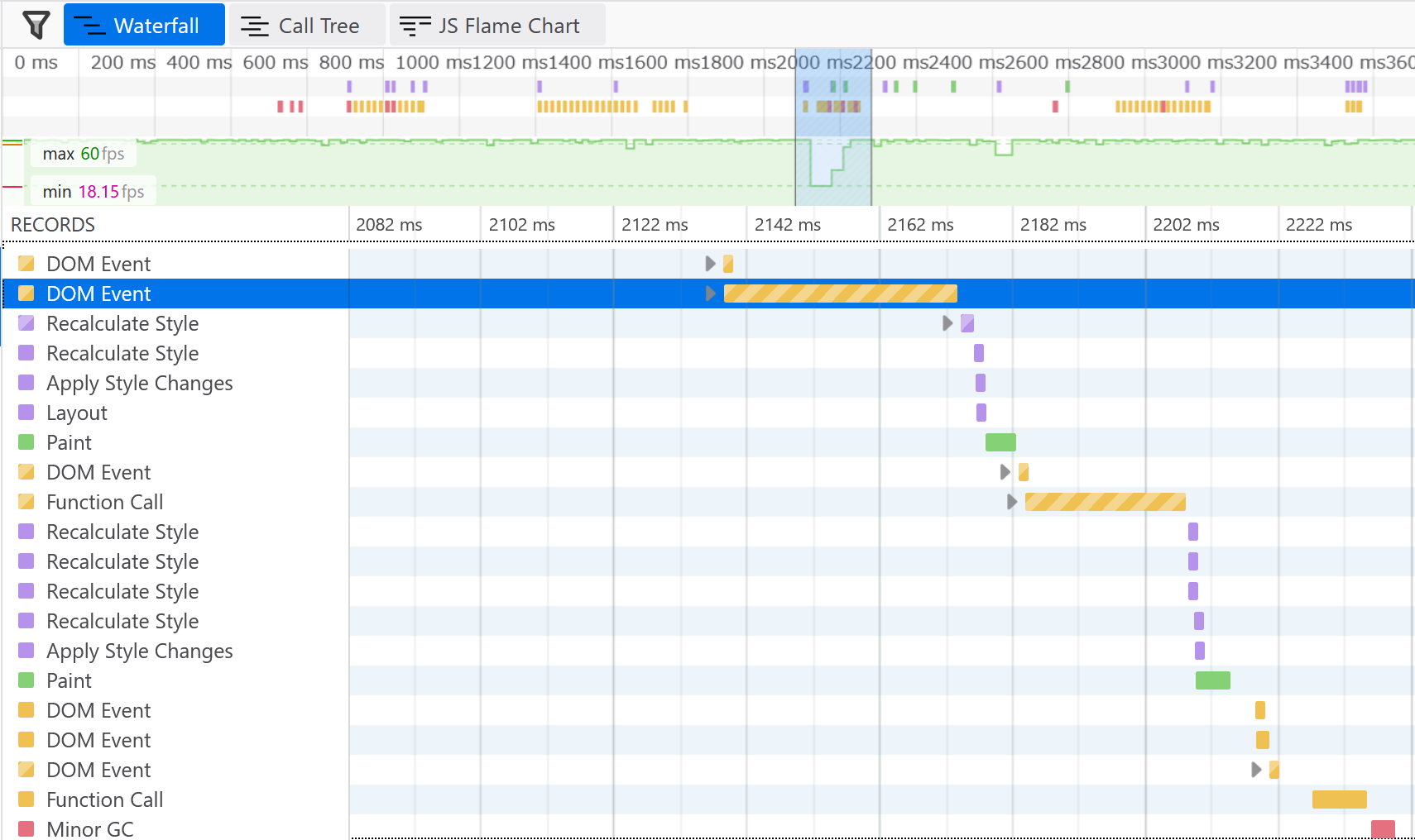
- Handle click
- Create DOM elements
- Resolve style
- (
<CSSTransition>resolves style and layout multiple times)
- (
- Calculate layout
- Paint each new element
- Run the transition
Headaches, dizziness, migraines, epilepsy…
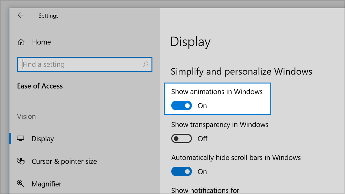
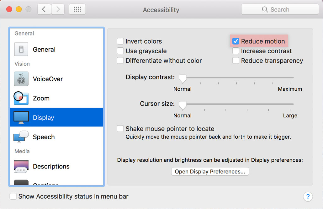
prefers-reduced-motion: reduce | no-preference
div {
  animation: ...
  transition: ...
}

@media (prefers-reduced-motion: reduce) {
  animation-name: none;
  transition-property: none;
}
- 64+
- 74+ (April)
- 10.1
- x
// Check for browser support
if (!('animate' in elem)) {
  return;
}

// Check for user support
if (matchMedia('(prefers-reduced-motion)').matches) {
  return;
}

// Animate away...